What is Responsive Email Design and How it Can Help your Business
These days, if an email is being read, it is probably being read on a mobile device. Phones and tablets account for more than half of all open emails, and that number continues to grow. For certain audiences, it is projected to soon reach 70 percent. 'Responsive design' is a concept from the world of architecture. Rather than simply designing buildings to be static structures, architects began to wonder how their buildings could 'respond' to having people within them. Bathrooms with motion-sensing lights, air-conditioned offices with motion sensing, and other more fun uses grew out of this idea: a building can change based on how many people are inside or whether there are people inside.
When mobile devices began to dominate web browsing, web designers took this idea and executed it. Rather than simply designing a web page to be a static "building," they could create a web page to fit, or "respond to," the device a reader was using to look at it. Responsive design in an Internet context means that the page changes to fit any size of viewer from any device in an optimal way.
More than half of all email is opened on mobile devices and people spend the equivalent of a day on their smartphones every week. Designing responsive emails is key to opening your bells and easing your sweat action.
Responsive vs. unresponsive design
If you've ever surfed the web on a mobile device, you've probably experienced both ends of the spectrum when it comes to responsive design. Non-responsive sites have small text that forces you to zoom in and out to read, links that are impossible to touch with your finger, and images that fill the entire screen.
However, sites that use a responsive design scale their images and text to clear, legible sizes and use easy-to-touch links, regardless of the device the user is using. It represents a change in the designer's goals, from designing an object, like you would design a magazine page or poster, to designing an experience.
Why use responsive email design
Mobile devices are taking over email just as they are taking over web browsing. Again, many users could be using a phone or tablet to read the marketing emails. If emails don't perform well on mobile devices, they will be sent directly to the spam stack. That means low engagementand low return on investment.
Email marketing doesn't come cheap, so it pays to do it as effectively as possible. That means responsive design. If readers can't see what your email is saying or if they can't click your call-to-action links, your email is dead on arrival.
How to maximize your responsive email design efforts
Smartphones and the constant update and change of email client technology While it is impossible to predict all scenarios, you can follow these general design best practices:
1. Choose a single column design.
Multi-column layouts can look great on desktops, but on mobile devices, they are often overwritten or items can be resized in unappealing ways. A single column layout will keep your content clean and easy to use.
2. Choose clean and bold sources.
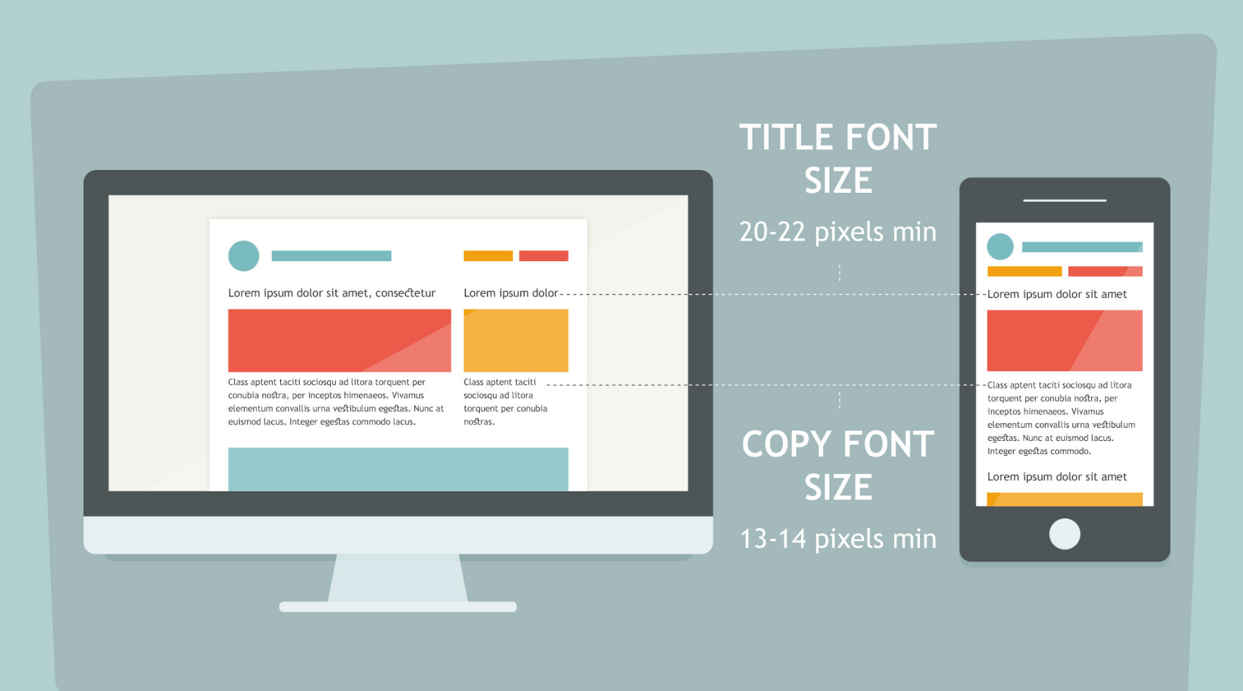
Ignore italic, delicate, or thin sources. Anything that looks small on a desk will end up looking even smaller on the mobile. Sweats won't bother to strain your eyes; they will simply delete your email and possibly unsubscribe.One of the most important things to consider in responsive email design is the width of your content. Readers shouldn't have to scroll the page from side to side to read what the email says, and they shouldn't have to zoom. Your font should be quite readable, definitely nothing below 12 points, and bigger is better here.
3. Don't overload the links.
Buttons and links are important too. A finger is much less precise than the mouse pointer, so anything you need readers to click on should be an easy target. You should also consider how close you put the links; nothing is more annoying for a reader than coming up with the wrong link. Most of us have experienced the frustration of trying to click on a link that is too close to another hyperlink. I don't dream of your sweats to that. Keep your text large, make good use of spaces, and allow plenty of space between unique hyperlinks.
4. Or don't even use no links at all
Instead of using textual hyperlinks, use bright, contrasting colored buttons when linking to your landing pages. Take the minimalist route when it comes to your links, as including too many options to click on can overwhelm readers, causing them to "freeze" and not click on anything at all.
5. Think in pictures.
If you're using images (which they probably should be), keep in mind that they will need to have a set width as well. Otherwise, they could break the sides of your email template. Large images may not load at times, so consider the type of information you include in them. In general, images should enhance the message, they should not be the only thing that conveys it
Readers tend to prefer full-width high-resolution images to small thumbnails. Make sure your email templates resize your beautiful images and media correctly for each screen so they don't end up squashed or stretched on the side of your sweat. Also make sure your large images don't take too long to load or consume your sweat data.
6. Strong content
You also need to ensure that your content is robust; Your email should grab people's attention. The most important content should appear before the reader has to scroll, as scrolling on a phone takes more effort than scrolling with the mouse.
Responsive design means that a web page changes to fit any size of viewer from any device in an optimal way. A concept that flowed from architecture to web design and now to email marketing, emerged as a response to the rise of mobile devices. Since up to 70% of people use their phones and tablets to surf the web and check their email, designers have had to satisfy their clients' preferences. While it is important to keep track of which email clients and devices your sweats use so that you can design appropriate bells for your emails, many sweats will likely open emails on multiple devices or seamlessly switch between mobile devices and computers. desktop. Do not block the encryption of specific emails. Instead, choose a responsive email template and follow these responsive email design tips to make sure your bells always look great.