Email Accessibility Guidelines, or Make Your Emails User-Friendly for Everyone
Email Accessibility Guidelines, or Make Your Emails User-Friendly for Everyone
Accessibility is a term that is often used in web development to make sure that the design that is being developed is accessible through all the devices that the users might choose to view the content. You must be thinking about what accessibility means in email marketing. It means the changes you can make in your emails' template and layout to make them easily accessible even by people with disabilities.
Importance of accessibility in emails
Accessibility is the practice of crafting the content so that even people with disabilities can access and interact with the content. You must be questioning whether it does matter in email marketing or not as you may feel it like something time consuming and are inclined to skip it.
A considerable number of people live with one or other disabilities. The disabilities may be audio impairment, visual impairment, or any other. People with impairments use smart assistance to interpret the content on websites. The web assistant devices convert the content into a form that is easy to access. For disabled, accessible content is a necessity.
Accessible content applies to people with disabilities, but it means more sense to consider it as more logical, readable, accessible, and understandable. Accessible content plays an important role in enhancing business.
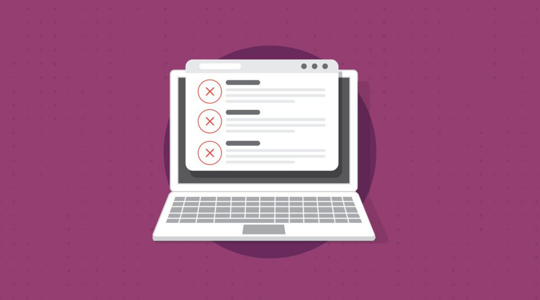
Make your content accessible
You should do some practices to ensure that your email campaign's content is accessible to your audience. Let's dive in.
Understandable subject lines
Your subject lines are the deciding factor that determines whether the audience would open your email or not. The subject lines must be interactive, brief, but descriptive to make the email's purpose clear and make your subscribers aware of what you want to convey through your email campaign. Subject lines are also considered to be an effective tool for increasing engagement.
Use logical structure
The logical structure involves making the email design responsive to all the devices. Responsive design involves how the content is coded and how templates resize on different devices to display a presentable layout. It is particularly important to have a logical structure for users who use screen readers. If you do custom coding, make sure that it is responsive.
Use headers
Headers play an important role in determining the informational hierarchy of any webpage or email. This helps in easy navigation and scanning of the content to assess its importance. Headers tell the audience whether the entire content is worth reading or not.
To identify the important sections of your email content, use H1, H2 …. Heading attributes rather than simply bolding or italicizing as the well-styled text may look attractive but does not mean anything to a subscriber who cannot see it.
Use contrast colors for easy readability
Color contrast plays an important role in not only highlighting the important portions of text in your email copy, but it also improves readability by designing the content in contrast colors. This goes well with the people who are color blind. Using color contrast for color blinds does not mean to use only black and white colors as they can distinguish any two different colors to be contrasting, though not the original shades. This is how they won't miss your content.
For this, you may get assistance from some online color contrast analyzer to analyze the best color scheme that may help you decide the best color scheme. You can check the view for the color blind to examine the idea they would get.
Don't write text on images
The people who have an image blocker in their mailbox or use a screen reader cannot see the text written on the images. If you are using infographics, make sure that your content would still be approachable if the images get blocked. You can also design your email to present the essential information in text and images for a complementary effect.
If you are adding some video links in your campaign. Make sure to add a transcript to your campaign for people with hearing issues.
Use Alt Text
Use alternative text in your email campaign for the people who cannot view your images usinga screen reader. Alternative text is a short description of the image used in the copy. It highlights how the image is related to the email copy.
Use hyperlink text
When you link any site or any content present on some other platform, try to use the link text instead of a raw link to give your subscribers an idea of what is in the link and, by clicking on the link, where your audience is directed. Don't use unclear link text as it may appear in-appropriate. Instead of just writing the link text "click here," it is more appropriate to write "click on CBT mass email sender to get the best email marketing services." This gives your customer an idea of what they are going to get on clicking.
Use plain text in your email
A plain text email is very simple, and they are easily accessible on any device because it does not contain HTML coding, images, and fancy graphics. If you are sending HTML emails rich in fancy styling, you need to make sure that your email also contains the plain text version. This is of great help for the users who have blocked the images. If creating only a plain text version of an email fulfills your need, it is okay to use plain text.
Final words
For creating an accessible email, you need to keep the above points in mind. You may feel some difficulty in practicing these tips. CBT mass email sender is here to help you out by making your emails accessible.