Design tips for images in your Emails
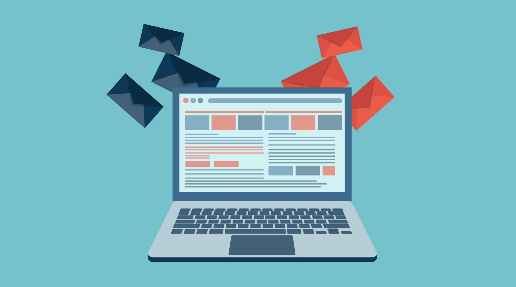
Emails are a great way of connecting with your subscribers all professionally but keeping in view that a person receives almost 60 emails per day so how would they specifically open your emails among a crowded inbox. To make your subscribers open your emails precisely, there should be the addition of some components to your emails to make them look attractive enough for your viewers.
The prime and the most notable factor that can make your email metrics increase is by adding pictures. According to a study, emails with images have a 45% higher open rate and click-through rate than text-only emails. So it is considered a great tool for email marketers to get an optimal open rate and click-through rates. This is because images grab the attention instantly and somehow it conveys the message behind the content. If someone sees a picture, they always try to decode the message behind it, and that is why images play an important part in email marketing campaigns if the email marketers integrate it wisely.
Certain factors should be kept in mind while adding images to your emails to avoid certain fallbacks that may occur because of using images in your email and seeing how to use image design wisely in your emails. These are as follows:
1. Create Brand awareness through images
Your images can play a vital role in creating brand awareness of your respective brand. For that, you should think about adding every possible brand element in your images that can assist you in your organization's branding. For instance, when you integrate pictures of your products or other relevant images, you should add your brand name or logo. Seeing that image will make your viewer have your company's perception place in the back of your time.
2. Use complementary colors for images
To make your images look pretty enough to grab your reader's attention, the most valuable component that you can implement is the color scheme used in the image. Try to use the colors in the background which you have used in your company's logo. Focus on developing a color theme that you can use in all your images you would be sending in future campaigns. By this, you will be able to make brand recognition. As whenever your reader sees those images, he would be able to guess the brand and recall the image you have built.
3. Select a suitable font for images
Choose wisely your font to add to the images. Don't use over flourishing fonts that can make your content look overcrowded. Your font size and style should be a bit different from the rest so you can make it highlighted, and also, they should befitting the rest of the content to make the email look well-composed.
4. Info-graphics
Info-graphics are the images with information integrated into it. Info-graphics are so useful to share for specific kinds of emails where you have some data to share. For instance, when you introduce a product through email, you mention its highlighted points on the image. When a reader sees that image, he quickly learns the size, price, quantity, stuff, etc., of the product because it is mentioned on the image, and the rest of the description about that product is mentioned in detail in the email body. That is why most email marketers mostly like info-graphics.
5. Look for your image size
Your image file size is a significant factor to consider while sending images. As you know, most of the receivers have blocked images from the sender's address. So if you have added a heavy size image, the server would automatically hurdle your image to get delivered. Your image size should be a maximum of 5MB. Otherwise, compressed it to the minimum possible size to make it convenient for your subscribers to load it easily.
6. Try to add 3D images in your emails
3D images give a great impact on the viewers. They are modern and well-liked by the audience as they are bored from the cliché images. Your image colors in 3D images should be reflecting your brand's color. They should look professional and relevant.
7. Image file format
You should go with the same file format in every email of your campaign. You must look at which sort of file format will best suit your audience and then go with the following. Otherwise, the most popular and common file formats are JPJ, PNG, etc.
8. There should be enough space around images
Your image must be inserted with some space around it. This is important to make your email look nicely composed. A crowded content in emails is a turn-off for your readers. As they don't need to waste their energy to understand your crowded emails.
9. Use Alt text
Most of the receivers have blocked images from emails for the consent of saving their data. In that case, ALT text is the most suitable solution as it will provide a minimum description of the image to the viewer, so they will decide whether to load it or not.
10. Optimize your images for all devices
Keeping in mind that most of your subscribers will be opening your email through mobile phones, you should optimize your emails and images for both the desktop and mobile phones. This all is done for the ease of the reader as there are chances that they can leave your emails right away.
Wrap up:
Wrapping up the discussion, you should look for the following things before you send it to your email contact list:
· The image design that you have selected should go with the email's landing page so that it can relate to the content.
· Complete everything in your email design before inserting it into the email so you won't be troubled later.
· Cross check your email before sending and check how it would be displayed on every device.